Database of Religious History
University of British Columbia
2014
The Database of Religious History (DRH) is a web-based database designed to gather standardized information on historical religious groups worldwide. It serves as a valuable digital humanities resource for the religious studies community.
Role
UX Lead
Team
1 UI Designer 1 Techical Director 1 Technical Manager 2 Full Stack Developers
Services
User Research End to End workflow Wireframe GTM strategy
Impact
Data entry abandon rate
↓ 15%
Additional grant
+ $2.35M CAD
Context
The Cultural Evolution of Religion Research Consortium (CERC) at UBC received a $3M CAD grant to create the Database of Religious History (DRH), the first online religious history database for North America. The objective is to develop a centralized repository of religious historical records that will be accessible to scholars, with plans to extend access to the general public in the future.
Challenges
Following the initial build, the Technical Director brought me on board to redesign the interface to enhance the data entry experience before the general release. One key challenge was the team’s lack of understanding of the users, as no user research was conducted during the initial build; the team assumed that being the users themselves was sufficient.
Process
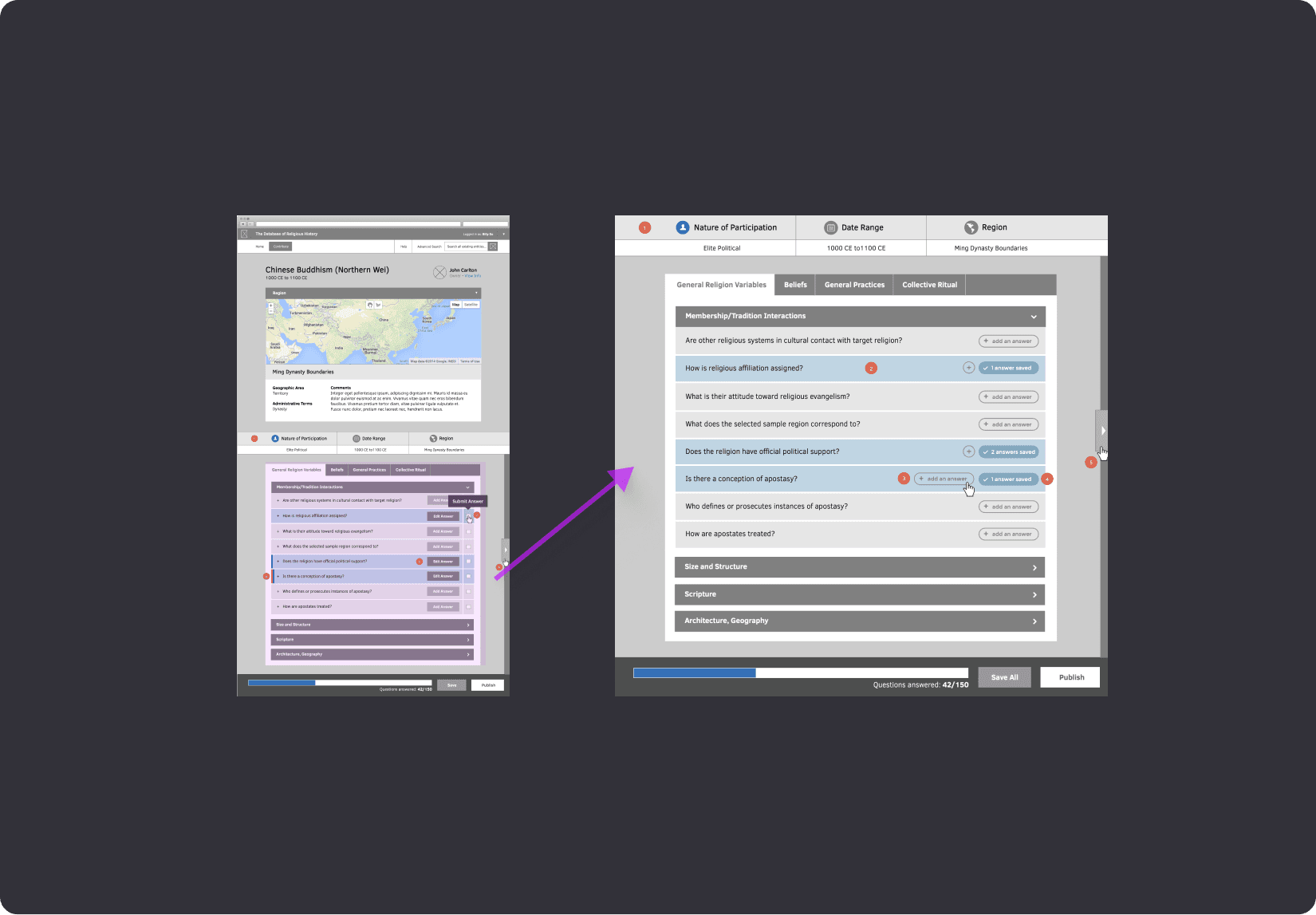
The data entry workflow for the DRH was complicated because of its nested data point structure — a technical constraint tied to how the database was built. Since there was no existing documentation for the workflows and screens, I created a wireflow — a mix of workflows and wireframes. This document now serves as our go-to reference and helps keep discussions on track as we move forward.
At the same time, I collaborated with the Technical Manager on a qualitative study to document user goals. The goal is to validate our assumptions about how users interact with the system.

An example of the wireflow documentation

Summarizing users’ goals using the User Story template: ‘As a [user role], I want to [goal] so that [reason/benefit]
A wireframe concept that uses tabs and accordions to help organize the data

We tested the sticky menu concept using the prototype, and all the results are recorded in the Google Doc
Features
Based on the results of the qualitative study, it’s clear that fixing the usability issue will only address the content contribution goal. Our users aren’t clearly divided by these goals; they usually have a mix of all three, with some leaning more towards one than the others.
With that in mind, I expanded our efforts beyond just improving the data entry experience. We added features like contributor profiles and progress trackers to support users in connecting with other experts and gaining recognition.
After I left the project, the team continues to enhance these features with another agency. Below is the latest design from the website, which follows my suggestions based on the qualitative study.

This is the browsing view. The high-contrast color scheme is also applied in the contribution view

Updated profile page

Contributors can add links to share their work

Contributors can track their progress and gain recognition within the community
Learnings
Uncovering the right problems:
Expanding beyond UI:
Communicating success metrics: